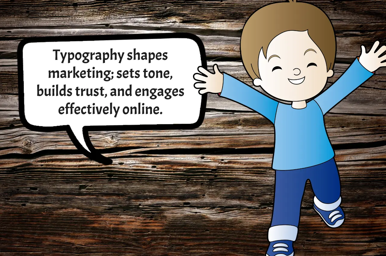
Typography, often overlooked in the world of marketing, is the silent influencer, an unsung hero shaping perceptions and driving engagement. In this digital age, where visual content dominates, the art of selecting and arranging fonts deserves more credit than it gets.
1. Setting the Tone with Typography
Typography isn’t just about choosing fonts; it’s a strategic tool for setting the tone of your message. Consider the stark contrast between a sleek, modern sans-serif font and a classic, elegant serif font. Each speaks a language of its own, influencing how your audience interprets your brand.
Take the case of a renowned tech company that revamped its logo with a bold, sans-serif typeface. The shift conveyed innovation and a forward-thinking approach, instantly resonating with a younger, tech-savvy audience.
2. Legibility: The Bridge to Connection
In the race to be visually appealing, don’t sacrifice legibility. A cluttered or illegible design can quickly alienate your audience. Remember the cautionary tale of a boutique bakery that opted for a whimsical, cursive font in its signage. The result? Customers squinting and passing by, missing out on delectable treats inside.
3. Consistency Builds Trust
Consistency in typography builds trust. Imagine visiting a website where every page uses a different font. Chaotic, isn’t it? Consistency fosters a cohesive brand identity, helping consumers recognize and remember your brand. This is the secret sauce behind successful brand campaigns that stand the test of time.
4. Typography in Social Media: The Scroll-Stopper
In the world of social media, where attention spans are shorter than ever, typography can be the game-changer. A bold, attention-grabbing font in your social media posts can turn a casual scroller into an engaged reader. Think of it as the pause button amid the ceaseless scroll—a chance to make an impression.
Consider the example of a fitness influencer who used vibrant, energetic fonts to overlay motivational quotes on workout videos. The result? A surge in likes, shares, and followers, all driven by the impactful use of typography.
5. Storytelling Through Fonts
Fonts tell stories. A vintage script font might transport your audience to a bygone era, while a futuristic font can catapult them into the future. Case in point: a travel agency that employed a rustic, hand-written font for its brochures, immersing customers in the allure of undiscovered destinations.
6. The Psychology of Fonts
Understanding the psychology behind fonts is crucial. Serif fonts often convey tradition and reliability, while sans-serif fonts exude modernity and innovation. Script fonts evoke a personal touch, while bold, all-caps fonts shout authority.
Remember the real estate company that switched from a traditional serif font to a clean, sans-serif font in its marketing materials? The change signaled a shift from old-school to contemporary, attracting a younger clientele seeking modern living spaces.
7. Call to Action: Beyond Words
Your call to action (CTA) is more than just words—it’s a design element. The right font can enhance the urgency of your CTA, compelling users to click, subscribe, or purchase. A travel website experienced a significant increase in bookings by switching to a bold, contrasting font for its “Book Now” button.
8. Mobile Optimization and Readability
As mobile usage continues to soar, optimizing typography for smaller screens is paramount. Fonts that are legible on desktop may become indecipherable on mobile devices. A responsive design that adapts font sizes and styles ensures a seamless user experience across all devices.
9. Future-Proofing Your Brand
Typography isn’t a fleeting trend; it’s a timeless aspect of design. Investing in a thoughtful typographic strategy ensures your brand remains relevant and adaptable. Consider the enduring appeal of Coca-Cola’s iconic cursive logo—a testament to the enduring power of well-crafted typography.
10. Your Typography Toolkit: Practical Tips
Contrast is Key: Use contrast to guide the reader’s eye. Pair bold headlines with simpler body text for an effective hierarchy.
Hierarchy Matters: Establish a clear typographic hierarchy to guide readers through your content. Headlines, subheadings, and body text should each have their distinct style.
Don’t Overcrowd: White space is your friend. Avoid clutter by giving your typography room to breathe. It enhances readability and aesthetics.
Test and Iterate: A/B testing different font combinations and styles helps identify what resonates best with your audience. Don’t be afraid to experiment.
Embrace the Typography Advantage
Typography, often overshadowed by flashy visuals, holds the key to unlocking meaningful connections with your audience. From setting the tone to fostering trust and guiding user actions, the impact of typography in marketing design cannot be overstated.
In a world saturated with visual content, mastering the art of typography is a strategic imperative for brands seeking to stand out and leave a lasting impression.
What’s your typography success story? Share your experiences and insights in the comments below. Let’s start a conversation about the transformative power of fonts!